Using the Chart Module to display information held in a DataSet.
If you are using v2, please use the following link: Chart Module Guide.
1.Introduction
The Chart Module is a feature that is used in conjunction with DataSets to easily present information, held in a DataSet, as one of the following Chart Types:
- Line
- Bar
- Pie
- Donut
- Horizontal Bar
- Radar
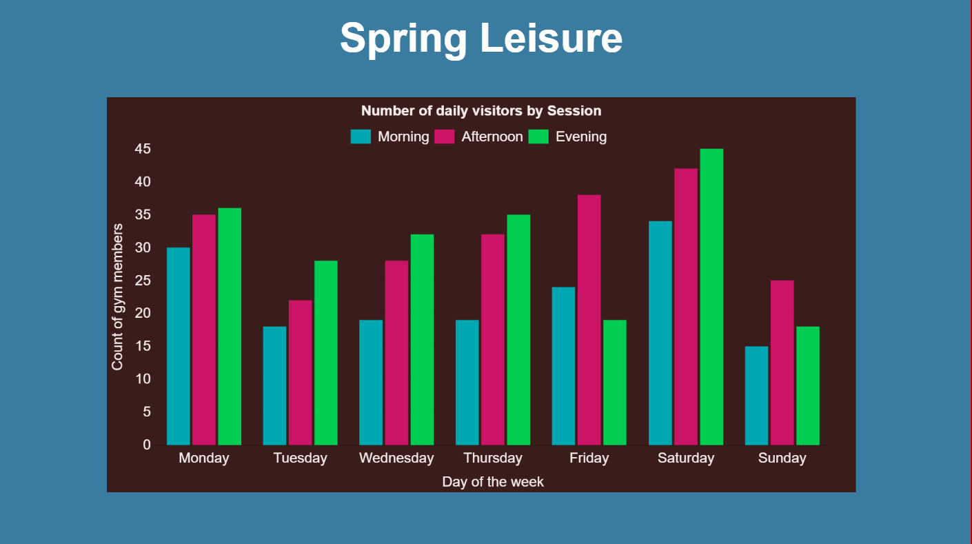
This tutorial will walk you through how you can produce a Layout to include a Chart to show how many gym members visit per session for a week, using my fictitious gym ‘Spring Leisure’.
2. Before you begin
This feature is available in the Xibo CMS 1.8.10 release or later.
3. Creating DataSets
First, we need to create and define the DataSet in the library.
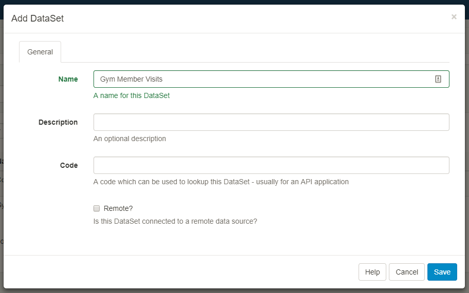
Log in to your CMS and go to the Library > DataSets.
Click on the Add DataSet button and give it a name and Save.
We need to define the DataSet fields and need to know the following information:
- The day of the week
- The session (morning/afternoon/evening)
- Count of gym members
So we need to create 3 columns in the DataSet:
- Day
- Session
- Count of members
Click on the drop-down Menu for your DataSet and View Columns. One Column (Col1) has already been added by default. Click on the drop-down button next to Col1 to Edit.
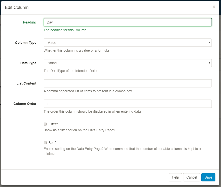
- Change Heading to ‘Day’
- Column Type set to ‘Value’
- Data Type set to ‘String’
- Column Order set to ‘1’ (the other values can be left blank)
- Save
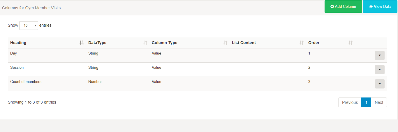
Using the Add Column button repeat the above steps for ‘Session’ and set a Column order of 2.
Repeat the above steps for ‘Count of members’ but this time change the Data Type to ‘Number’ and set a Column order of 3.
You should now have a Column structure that looks like this:
Next, we need to add some data to our DataSet. For this example, I have manually entered my data but you could choose to import data directly in from a CSV file, which could also come from another system.
Click on the View Data button, then Add Row.
Complete Data so that you have each day of the week, with a Morning, Afternoon and Evening session completed with a number included to represent the count of members.

Add additional Rows so that you complete all days and all sessions.
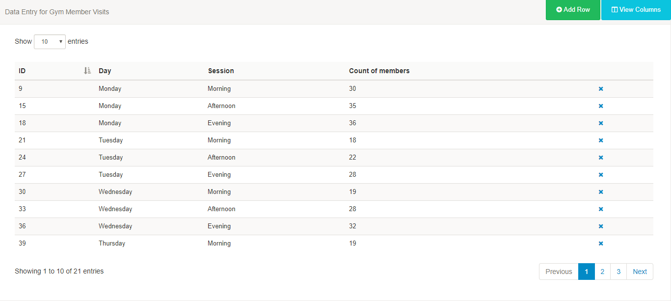
You can make edits by clicking on the row you wish to amend and Saving.
You should now have a structured DataSet with data that you can use to include the Chart module in a Layout!
3. Create your Layout
From the main Dashboard, go to Layouts
- Add Layout
- Resize and position your Region
- Save Region Positions
- Add an image or choose a coloured background
- Edit the Region Timeline
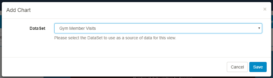
- Select Chart
- Select the DataSet - ‘Gym member visits’
- Save
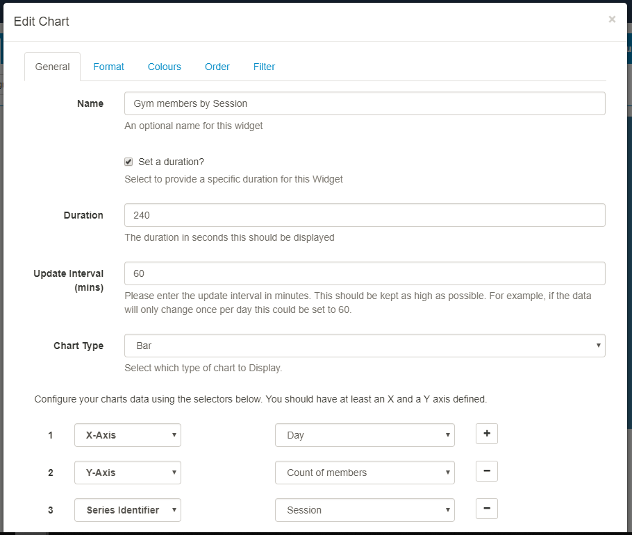
We can now Edit the Chart module to suit your specific needs.
General
- Tick ‘Set a duration’ to change the default time to a value that is more appropriate for your Layout.
- Update Interval - 60 mins (this should be kept as high as possible)
- Chart Type - Bar (choose the chart type to best present your information)
You now need to configure your chart data and define an X and Y axis. As I want to show the count by session I also need to add a Series Identifier.
(If I did not include a Series Identifier the Chart would show a total sum of all Sessions for that day).
- X-Axis - Day (click on + icon)
- Y-Axis - Count of members (click on + icon)
- Series Identifier - Session
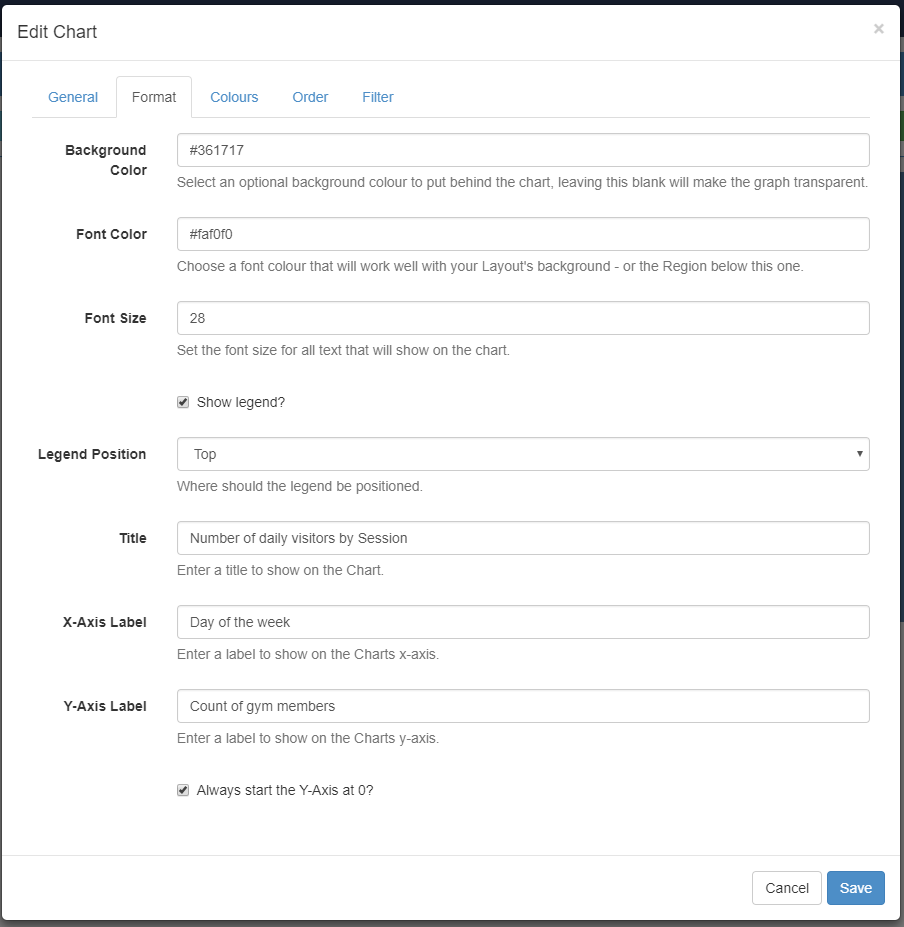
Format
- Select an optional background colour for your Chart
- Choose a font colour to complement the background colour
- Set the font size for all text contained within your Chart.
- Tick Show legend
- Position Legend - I have chosen this as the Top
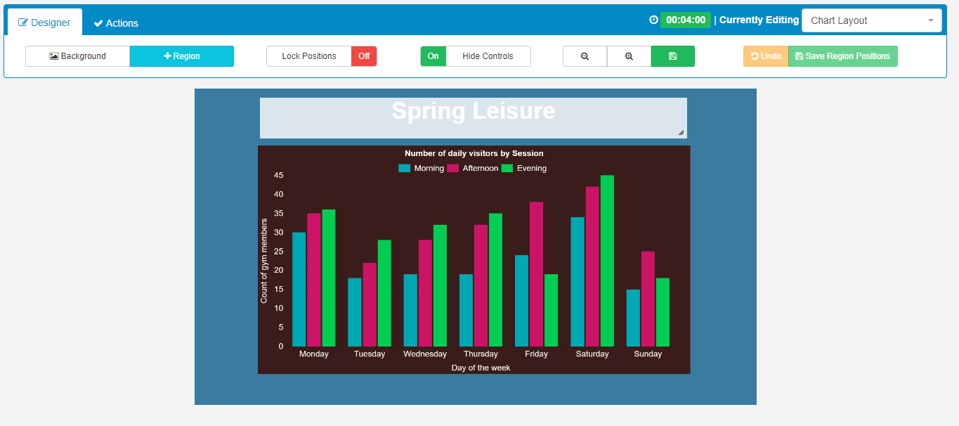
- Give your Chart a title, to be displayed - Number of daily visitors by Session
- Label the X-Axis, to be displayed - Day of the week
- Label the Y-Axis, to be displayed - Count of gym members
- Tick if you want the Y-Axis to always start at 0
Colours
- Select different colours for your Charts data series. I have selected 3 different colours to clearly show my Morning/Afternoon/Evening data in my Chart.
- Save.

Order
DataSet results can be ordered by any column using the clause builder or by providing a SQL command for more complex ordering. We do not require any ordering for this tutorial.
Filter
DataSet results can be filtered by any column by using the clause builder to only include/omit your DataSet results based on your chosen criteria.
(For example, you could apply a filter to only show by ‘Day’ and or ‘Session’)
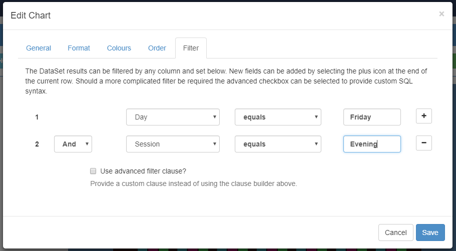
I do not want to apply a filter for this tutorial so you can close your Region Timeline.
The Layout will now show the selected Chart.
Preview the Layout using the Actions tab to see the data displayed in a Chart as defined in the DataSet.
If you edit the data contained in the DataSet your changes will be available in the system straight away ready to be picked up by the clients on their next collection.
Happy with the preview? Layouts can now be scheduled as normal to be shown on your chosen display/display groups
Additional Guides utilising DataSets:
Getting Started Guide - Meeting room bookings
Building an ‘Hours since last incident’ counter
Additional help available:
Troubleshooting