Over the past months I’ve been working on a Xibo server, just for a hobby and see it’s potential. I’ve been working with a UX designer to make a design language that’s simpel yet pretty. I would love to hear your feedback to enhance the experience and let the creative juices flow. I can take rough criticism.
Currently I have five layouts: clock (haven’t really worked on it), calendar, weather, a introduction video and news. The CMS is installed on a webserver and the Android player is running on a Amazon Fire Stick TV (I think I’m gonna try a 4K version just to see if extra horsepower will help run animations smoother). The intro video’s as seen in the video are made by me in After Effects. I’ve uploaded the video to Youtube and marked it as hidden. I’ll take it down in one or two days. And sorry for non-Dutchies: everything is in Dutch. Also sorry for the poor video quality, but it’ll do.
Clock: nothing to really say here. At te moment I’m experimenting with combining the standard digital clock with a modified analog clock without the watchface.
Calendar: now it’s starting to get interesting. This is the first layout that uses a video as an intro to grab attention. It’s suppose to be falling confetti (to illustrate a party). After the intro, we have three tickers: one to grab the image from an RSS feed, one to grab the name, date and location for the event and one to display the date a big bigger.
Weather: again a video to start the layout. It includes falling rain and a sun moving overhead. Next is the weather widget with some CSS to delay the incoming text so you can see a beautiful local picture before seeing the actual current weather. Next layer is another local picture with a forecast written out. The pictures are grabbed randomly from the server with a PHP script, corresponding with the time of day and weather report as shown.
Introduction video: just to test out how video might work. It runs smoothly till a hick-up at the end, but that’s a render error and not a CMS/hardware problem.
News: I’m pretty proud of this one. The intro video is a car slamming into a tree and an ambulance that rushes to the scene. Next are three tickers: one to grab the image that comes with the news item, one to display the headline and one to display the first sentence of the article. My UX designer focussed on this layout the most and I tweaked it a little to make it more pleasing to the eyes.
Not shown: did you know. Right now I’m working on a facts layout that shows a random local fact grabbed from a PHP script. This will most likely look similar to the weather layout. If you have any idea’s, I’d love to hear them!
1 Like
Parabéns!!!
Gostaria de ver outros conteúdos, se possível postado no youtube.
Sucesso…
Hi
i think this presentation is a very professional work and look very well.
but i have some sugesstion:
-
Clock: for me the hand of a clock are a littel bit to long and to thin. That the Analogclock is in the Background is ok, but you see the black boxes around the digits of the digital clock. Maybe its possible to make the black boxes transparent?
-
Opener with Confetti is ok, but what have Confetti to do with a reopening of an Albert Heijn and a BBQ Spectacle? On the left site, where the “Agenda” is written, for me its so mutch white space under the Agenda. The rest of the design works for me. It has a clean structure an is obvious.
-
Weather: Why is the Sun so high in the Window. But it a littel bit downward, so it’s not scratch the frame. OK the Backgroundimmage in the Video is to dark, but i belive you have other photos to set in.
Thank you for sharing your Workwith us, an we can see what other Guys do with Xibo.
It’s always an inspiration for the own work.
I hope my review is not so hard?
Greetings Torsten
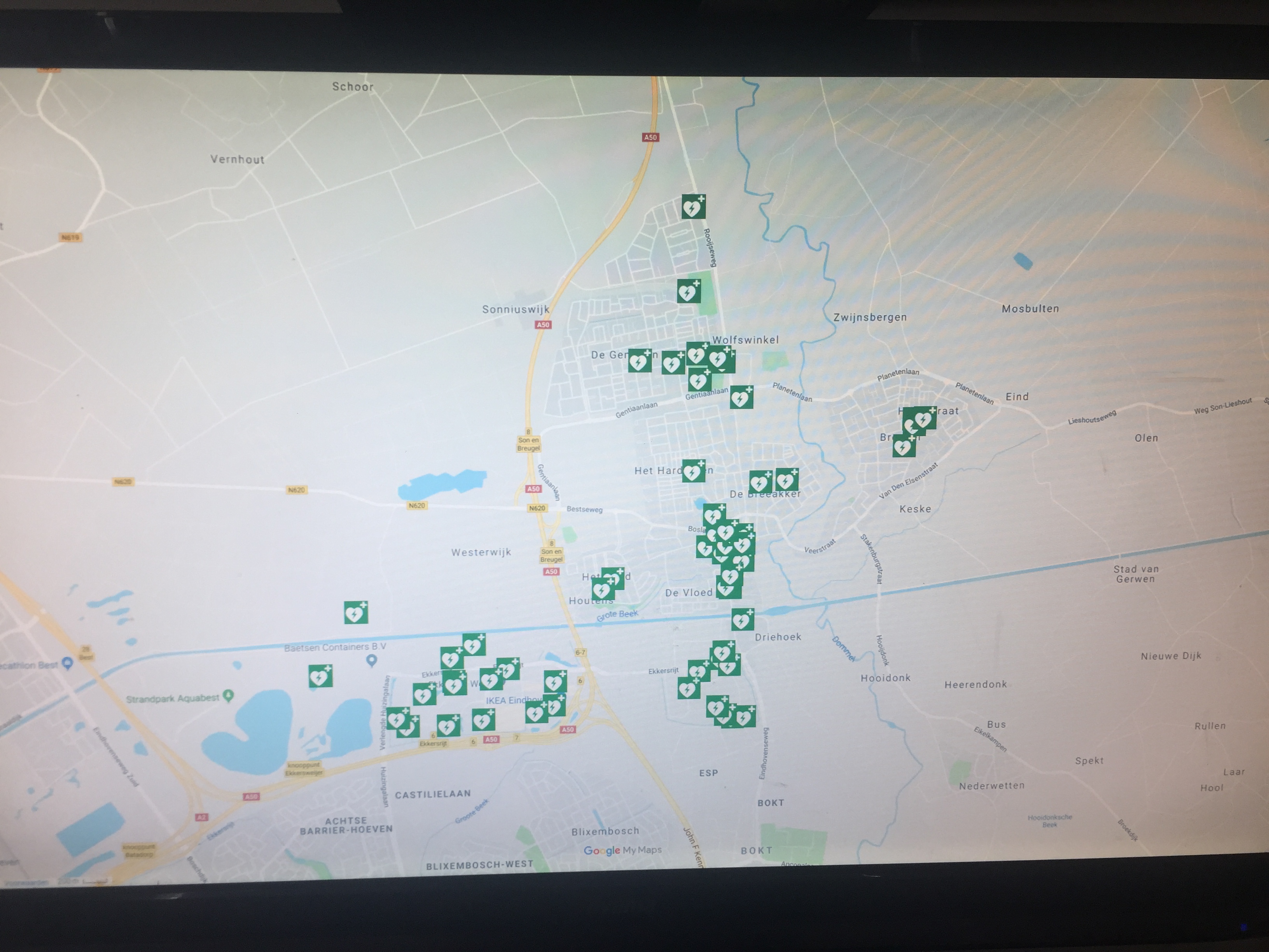
Thank you for the feedback. I’ve been working on it for the last couple of days. I’ve added a layout that shows defibrilator locations, pulled from an HTML/PHP script that fetches a photo, location and description. Also added the random fact layout, pulled from an HTML/PHP script full of random facts. Background is still static though. Changed the opener for the calendar and news. Removed clock untill I get inspiration.
You can see the progress on Youtube.
Hi,
I have a idea: When you explain where the defibrilator is, why you dont show a map? or a map (as a overview) and a detail phototo see where the location excatley is?
Its make for me more sense, because not anybody (Tourists, non-locals, Stranger) knows exactly where the AED is and thus there a time wasted for the Person who needs help.
The rest of the presentation is ok, i give you my feedback about that, above.
Greetings Torsten
Great point. The photo is mostly for people who do know they way around town. There is a Google My Maps available, gonna see if I can implement it after the photo.
Ok, but when the Display is visible in a public place, it would be the best if everybody can find the AED when a dangerous situation is occured. Thats the reason, why AED ist placed on a public place too.
So eveybody can help.
I dont know if the Googel Map Widget the best practice for that.
I woud place a screenshot from a Map and mark the place of each AED with the official AED Sign.
Greetings Torsten
There already is a Google My Maps map available, run by a local defibrilator organisation. Saves me a lot of time and the map will always be up-to-date.
I’ve implemented the map. I’m currently running it on a 24 inch screen, hoping the visibility will improve when I display the map on a bigger screen.
Thats nice to hear! Less work for you.
Maybe you can adjust the zoomlevel of the Map so it fit’s better to the screenresolution.
Greetings Torsten
Default zoom level was 14. If I change the zoom level to 15, locations on the edges aren’t visible any more or clipped. So can’t zoom in any farther I’m afraid.
Hmm ok. A good reason to speak with you boss the order a 4K Tv 
or another TV like this, to make a Video Wall…
Maybe it make sense to use 2 TVs vertical ?
If you need a better zoomlevel you need more resolution in the width.
Greetings Torsten
I’m the boss. I’m planning on using 4K televisions, but how can the increase in resolution increase zoom level for beter visibility?
Ahh ok Than it’s in your Hands to bye the TV… 
Ok. who i explain… for now you use a Full HD TV? Resolution is about 1920x1080?
When you use a 4K TV the resolution is about 4096 × 2048.
So you have four times more area to display content?
Or you bye another TV like the same that you have and make a vertical video wall.
Thats double the area for display content.
Am i wrong?
Ok if you have a 55" FullHD or a 55" 4K…The Size is the same…
OK, im not sure if you need more Resolution or a lager TV…
Greetings Torsten
Getting a 4K television does allow me to display more information, but doesn’t help in this case. It will display the same information, only in a higher resolution.
HI
OK, make sens to me. Than you need a larger Display or TV.
We have a 32" LG TV and our Map fits good in this size.
I dont know, perhapsit hels a 45" or 55" Display or TV?
LG have Displays up to 98" in their Productionrange. So have a look.
Greetings
Torsten
WOW! I love it!
All I can do with the CMS is use the dafault layouts. That works also, but this so much more eye-catching!
As I am building this for our rowing club, I am very interested in the weather forecast. I am using an Iframe in an layout, but this makes the layout dependent on the supplier of the widget for the weather forecast.
How do you create this? You are talking about a new language?
Can you share some more information?
Regards, Peter
I’m using the default weather widget in Xibo, just used HTML and CSS to style it.
I was able to make the settings, and the weather forecast is working fine now.
Do you know a method of converting the windspeed from km/h to beaufort?
The windspeed is Beaufort seems to be not supported in the forecast Substitutes.
Regards, Peter
Hi
the only thing i see, is a little Javascript to convert km/H in Beaufort…
Greetings Torsten
<center><span style="font-size:45px"> Windspeed:</span></center>
<br>
<br>
<center>
<span style="font-size:70px">
<script type="text/javascript">
var windspeed;
windspeed ='[windSpeed]';

if (windspeed <=1.85) {document.write("<b><span style=color:#ffffff>0</span> <b>")};
if (windspeed >=1.85 && windspeed <=7.41) {document.write("<b><span style=color:#ECECFF>1</span> <b>")};
if (windspeed >=7.41 && windspeed <=12.96) {document.write("<b><span style=color:#D9D9FF>2</span> <b>")};
if (windspeed >=12.96 && windspeed <=20.37) {document.write("<b><span style=color:#C5C5FF>3</span> <b>")};
if (windspeed >=20.37 && windspeed <=29.63) {document.write("<b><span style=color:#B0B0FF>4</span> <b>")};
if (windspeed >=29.63 && windspeed <=40.74) {document.write("<b><span style=color:#9B9BFF>5</span> <b>")};
if (windspeed >=40.74 && windspeed <=51.86) {document.write("<b><span style=color:#8383FF>6</span> <b>")};
if (windspeed >=51.86 && windspeed <=62.97) {document.write("<b><span style=color:#6868FF>7</span> <b>")};
if (windspeed >=62.97 && windspeed <=75.93) {document.write("<b><span style=color:#6868FF>8</span> <b>")};
if (windspeed >=75.93 && windspeed <=88.90) {document.write("<b><span style=color:#0000FF>9</span> <b>")};
if (windspeed >=88.90 && windspeed <=103.71) {document.write("<b><span style=color:#0000BB>10</span> <b>")};
if (windspeed >=103.71 && windspeed <=118.53) {document.write("<b><span style=color:#000077>11</span> <b>")};
if (windspeed >=118.53) {document.write("<b><span style=color:#000000>12</span> <b>")};
</script>
</span>
</center>
This works in my Environment, I hope it helps you.
Create a new Weather Widget and use “Override Template”, put the Code in the first box, second empty.
You can edit this script if you want. Colors are from the Wikipedia Beaufortscale
Greetings Torsten