This guide is applicable for users of a v3.1 and later CMS
v3.1 builds on past releases with tweaks made to the Layout Designer and includes new functionality to improve the overall user experience when editing Layouts.
We have made it much easier for Users to create Layouts right from the start of the process.
On selecting the Add Layout button from the Layouts grid, Users will be presented with a selection of Templates:
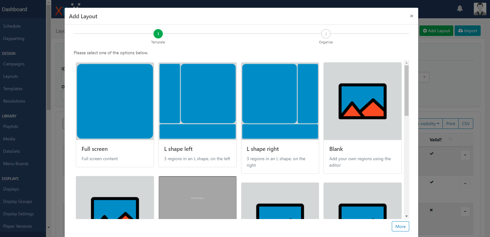
Users can select from one of the default Templates or select from their own designs (saved and published Templates) which will be available in this list.
- Select from one of the available Templates and scroll down to click the Next button.
- Use both tabs to complete the relevant form fields:

On saving, the Layout Designer will open:
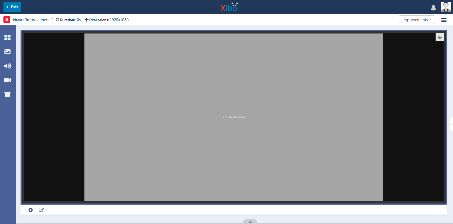
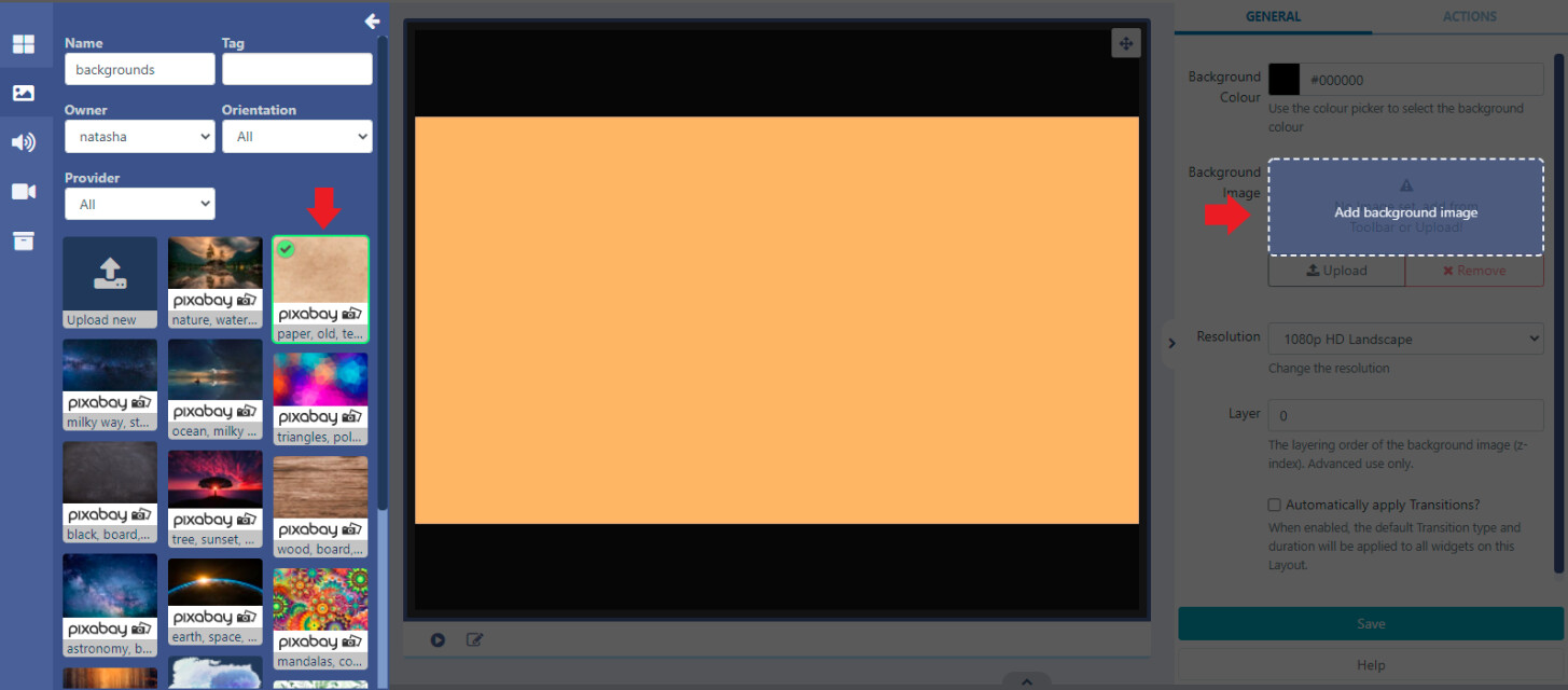
On the right hand side is the Properties Panel used to edit and configure the Layout, Regions, Widgets and Media. On adding/selecting any of these elements, available options will be shown here (options will vary dependant on what has been selected):
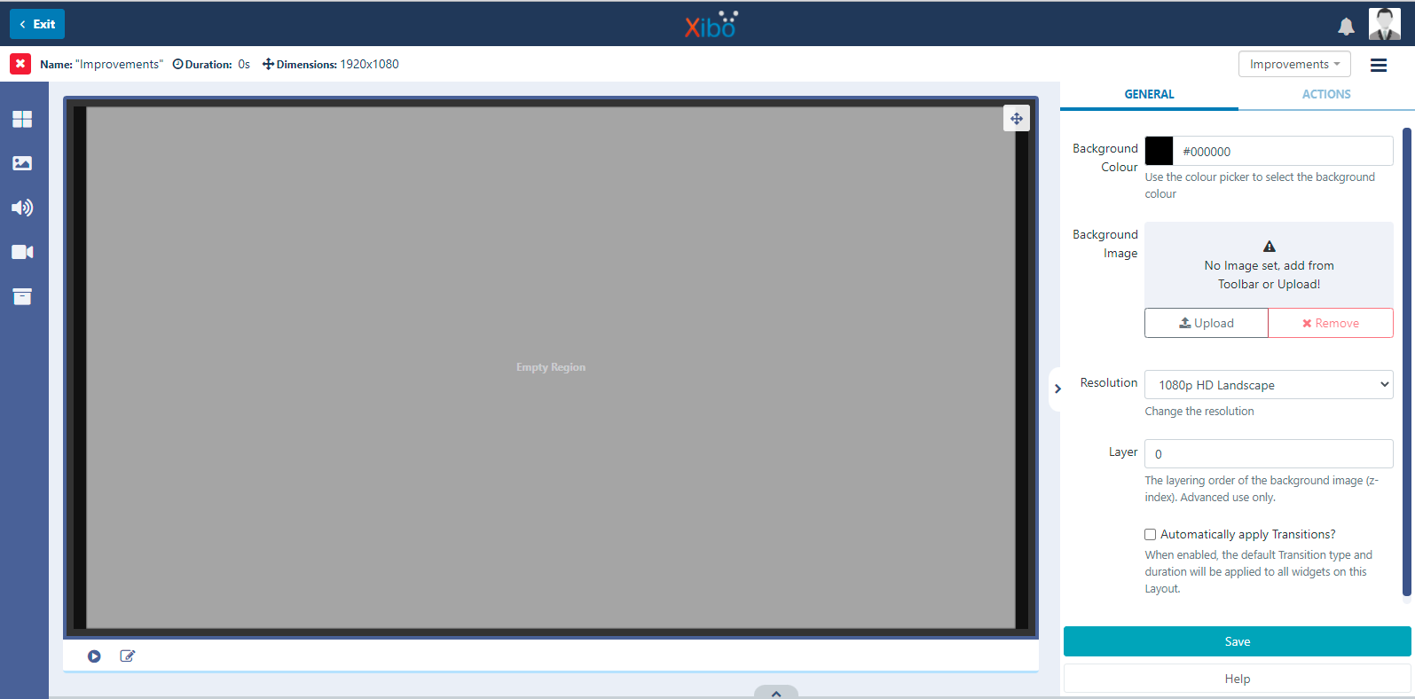
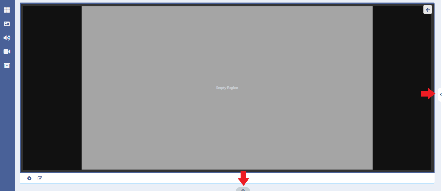
At the bottom is the Layout Timeline which will show Regions added to the Layout as well as the duration and order of assigned Widgets and Media:
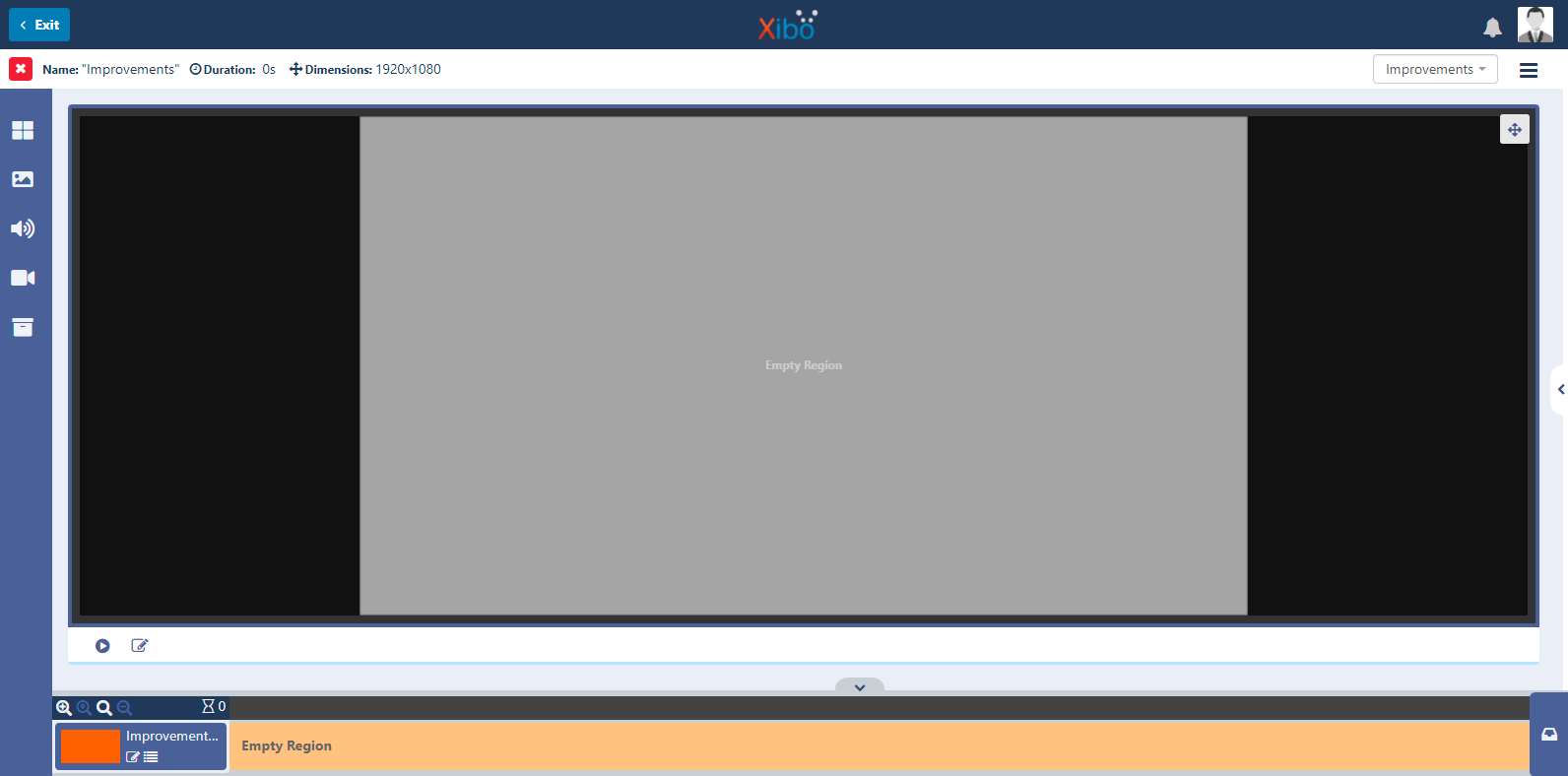
Both the properties panel and timeline can be disabled from view by using the arrow tabs to give a cleaner workspace and maximise the ‘working area’
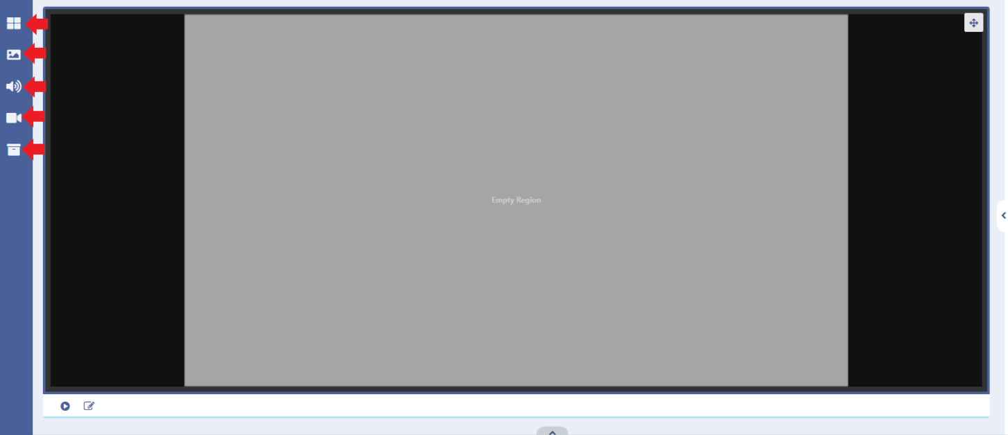
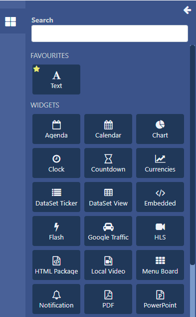
We have moved Widgets and Library Search media to the left hand Toolbar:
Widgets are searchable and have a separate section for those that are marked as a ‘favourite’ (by clicking the yellow star in the top left corner of a Widget) making them easier for users to find and add to Layouts:
We have made some improvements to some of our Widgets which include the following:
- New Horizontal and Vertical alignment options
- Agenda replaces the ‘Calendar’ Widget in name only, retaining all the same functionality
- Calendar is a NEW Widget which provides a simple way of displaying events in a Schedule/Daily/Weekly/Monthly format, with customisable colours and fonts as well as some great templates to choose from.
- Improvements to the Weather Widget (incorporating the ‘best bits’ of the developmental Weather Tiles Widget)
- Widgets that use a DataSet, DataSet View for example, can now be edited to use an alternative DataSet (rather than having to add a completely new Widget). Options would still need to be re-configured to ensure that they are suitable for the new datasource.
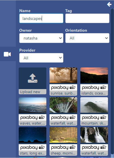
The next button opens the Library Image search function:
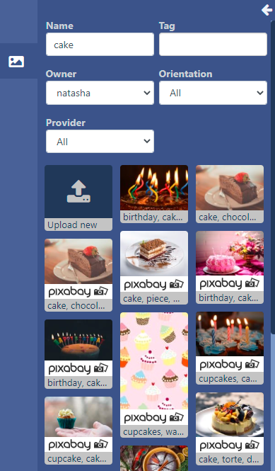
- Use the available filters to narrow down searches of media already added to the Library
We have added integration with Pixabay (this is enabled by default for Xibo in the Cloud customers) to make finding the right images/videos easier for Users (without the need to leave the CMS). Image and Video files that are selected to be used from Pixabay will automatically be added to the CMS Library for future use.
Pixabay can be enabled from the Administration section of the CMS by clicking on Applications and using the Connectors section. Configure and enter an API Key from signing up for a Pixabay account.
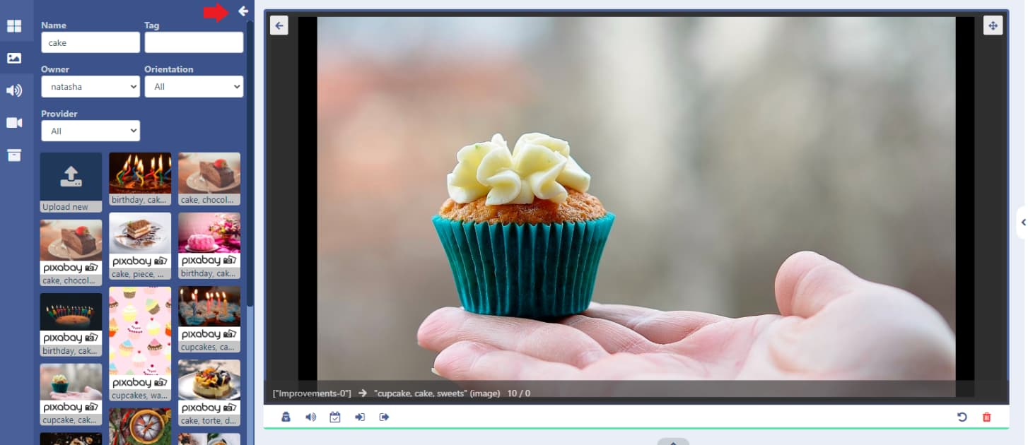
Image (and Video) files can be previewed to ensure that the image or video selected is suitable for your needs before adding to the Layout.
- Click on the play icon in the top right of the file thumbnail:
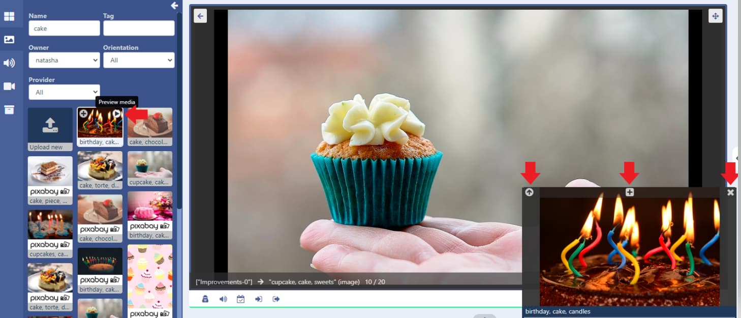
- Add from the preview by using the
+icon in the center of the window, use the arrow in the top left of this window to change the window size for easier viewing and click thexto close the preview window.
- Select the Upload new button to add to Layouts and upload new media files directly to the Layout:
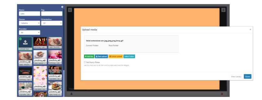
Uploaded files will also be added to the Library.
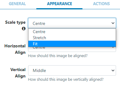
Images now have an additional Fit Scale type option:
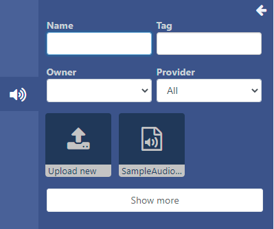
Next is the Library Audio search function:
Next is the Library Video search function:
Lastly is the Library ‘other media’ search:
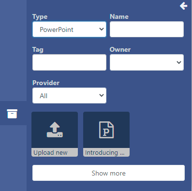
- The Type drop down is used here to filter by Flash, HTML Package, PDF or PowerPoint.
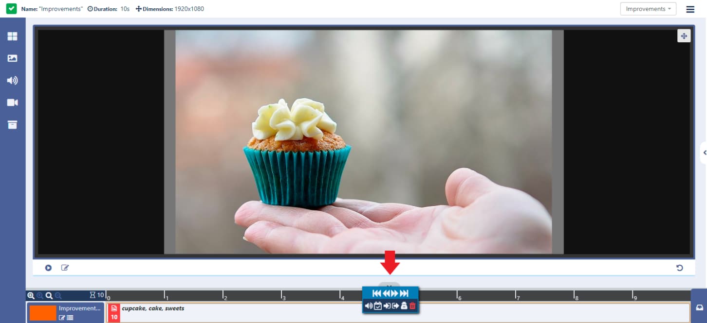
Once media has been added, the Toolbar can also be disabled from view using the top arrow:
A Context Menu of options is shown under the viewer; Sharing, Audio, Expiry dates and Transitions can be applied to the selected Region, Widget or Media file.
This menu can also be accessed by right clicking in the target Region, Widget or Media.
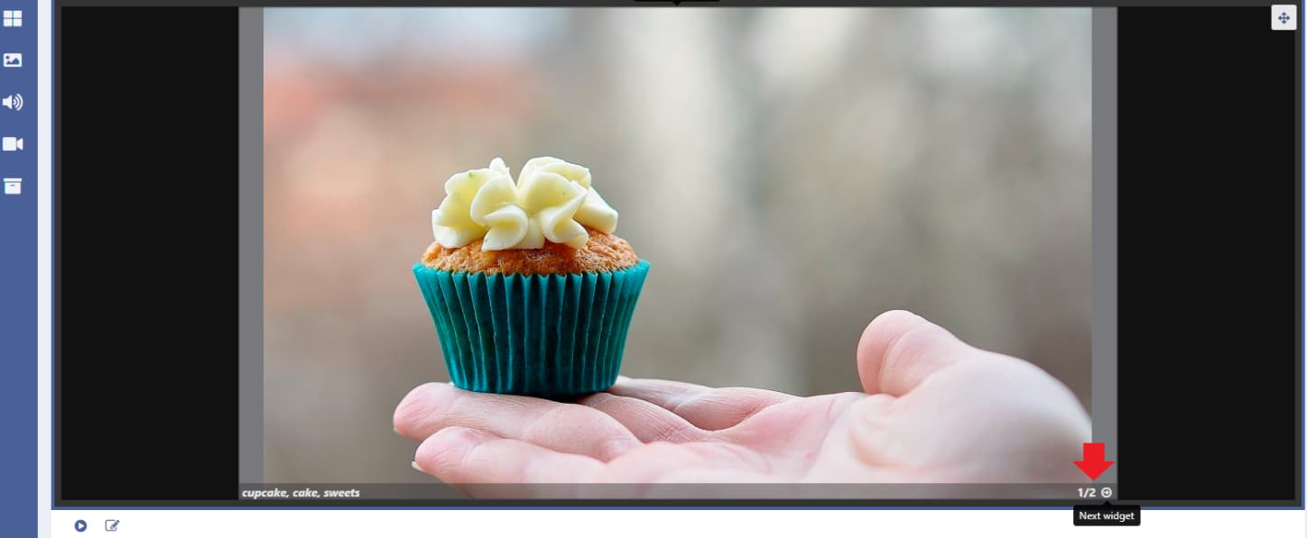
When using multiple Widgets in a Region, rather than enabling the Timeline to view what has been added, use the arrows in the bottom right of the viewer to cycle through and easily see where you are and view exactly what has been added.
- Use the arrow in the top left of the viewer to exit out of selected Widgets/Media/Regions to return to the Layout view:
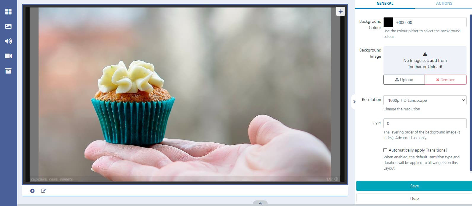
Whilst in Layout view you can now select an image to use as the Layout Background from the toolbar and click to add or drag and drop
Press the play button located under the viewer in the Layout view to play a full preview of your Layout:

Use the button in the top right of the viewer to toggle to fullscreen to preview before pressing play!
Content added to a Region can also be viewed in the Layout view, with each Region having its own cycle of content viewable from the arrows in the bottom right of each Region on the Layout:
The adding and editing of Regions has not changed. Use the edit icon located next to the Play icon, whilst in the Layout view, to open the editor:

And we have moved the Interactive Drawer to the right of the Timeline, which can be toggled on and off from view:
Take a look at our guide on how to Create a Simple Layout to get started!