CSS Formatting in Ticker not applied correctly

Hi Xibo folks,

i’m struggling with the css formatting inside a Ticker region (again) not behaving as expected.

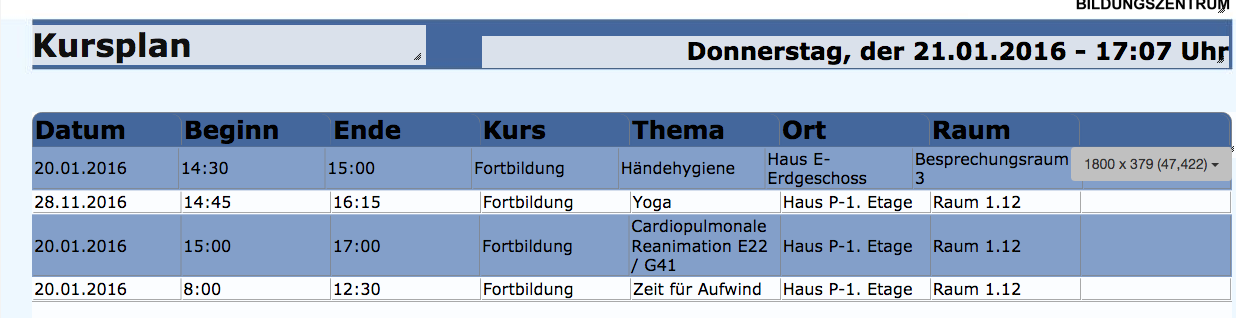
I created a region with a ticker that uses a dataset and the CURDATE() filter method to display a schedule in a table. The html of the table looks as follows:

<table>
	<tbody>
		<tr>
			<td style="width: 200px;">[DatumAnzeige|16]</td>
			<td style="width: 200px;">[Startzeit|17]</td>
			<td style="width: 200px;">[Endzeit|18]</td>
			<td style="width: 200px;">[Kurs|19]</td>
			<td style="width: 200px;">[Raumbeschreibung|22]&nbsp;[Ressource|24]</td>
			<td style="width: 200px;">[Haus|20]</td>
			<td style="width: 200px;">[Raumnummer|21]</td>
			<td style="width: 200px;">[Haus 2|23]</td>
		</tr>
	</tbody>
</table>

I applied the following additional css to the ticker-table:

    body {
        font-family: Verdana;
        font-size: 1.5em;
    }
    table, tr {
        width: 1800px;
        padding-right: -10px !important;
        border-collapse: separate;
    }
    
    td {
        border-right: 1px solid grey;
        border-bottom: 1px solid grey;
    }

tr {
overflow: hidden;
}

div.item:nth-child(odd) {
        background-color: #839FC9;
        overflow-x: hidden;
    }

div.item {
padding: 0px !important;
}

div.item:last-child {
border-bottom: 1px solid grey;
}

Unfortunately, some of the repeated rows are not in place:

The topmost row below the headline (the one with 20.01.2016) is displaced - the cell width seems to be off for some reason.

The data displayed in this specific row doesn’t seem to be much different than the other rows - still it is causing problems.

Do you have any idea what i am doing wrong?

Any help is gratefully appreciated…

Greetings

Sundance

Looks to me like it’s the length of the single word in your text in the Raum column that’s too wide for the space you’ve allowed it and so it’s squashing all the others over.

You might try either shrinking the text size or making that column wider.

1 Like

You’re a genius, Alex… how could i not see that :angry:

This is the solution… thanks a lot!

Best regards

Sundance

1 Like

Hi,

unfortunately, i’m not able to find the right css-based solution (changing the text is no option for now, sadly…)

What i tried:

  • tried to add width: 200px; text-overflow: clip; overflow: hidden to the td in the html (as inline css) but it just doesn’t clip
  • tried to add these css rules to the “additional style sheet” but to no effect

What i want:

  • i want the single words to clip when they are too long, but eventually break to a new line when the cell content becomes too much… is that even possible?

Thanks for any help…

Greetings

Sundance

word-wrap: break-word;

Perhaps?

I am not 100% sure but you might need to also add table-layout: fixed

Thanks Peter, the property itself is exactly what i was looking for - but i’m style struggling to apply it the right way. I have tried adding it both inline and in the addition style sheet field, but it doesn’t work…

I can’t use “table-layout: fixed” cause it will mess up my layout unfortunately - i fixed the width using width:100px…

Any ideas where to put it?

Thank you so much…

Perhaps @dan will have some idea, I am sure he will take a look once he has a moment.

You need to use a DataSet module if you want tabular data, because Ticker will apply your template for each item returned - i.e. you don’t have 1 table you have a table per line.

1 Like

Thanks for your reply dan - i will try the DataSet module and see if i can get the formatting right. I know the Ticker module “repeats” the table lines, but i felt like it was the right tool for this job… the word break is the only error left…

The trick within the ticker module is to set the “word-wrap” as inline css inside the html of the ticker region, it works as expected then…

Thanks for your help guys! I will report back if it worked or not…

Kindest regards

Sundance

1 Like

Sorry to say, but you will never be able to line up those separate tables. I speak from bitter experience :smile: