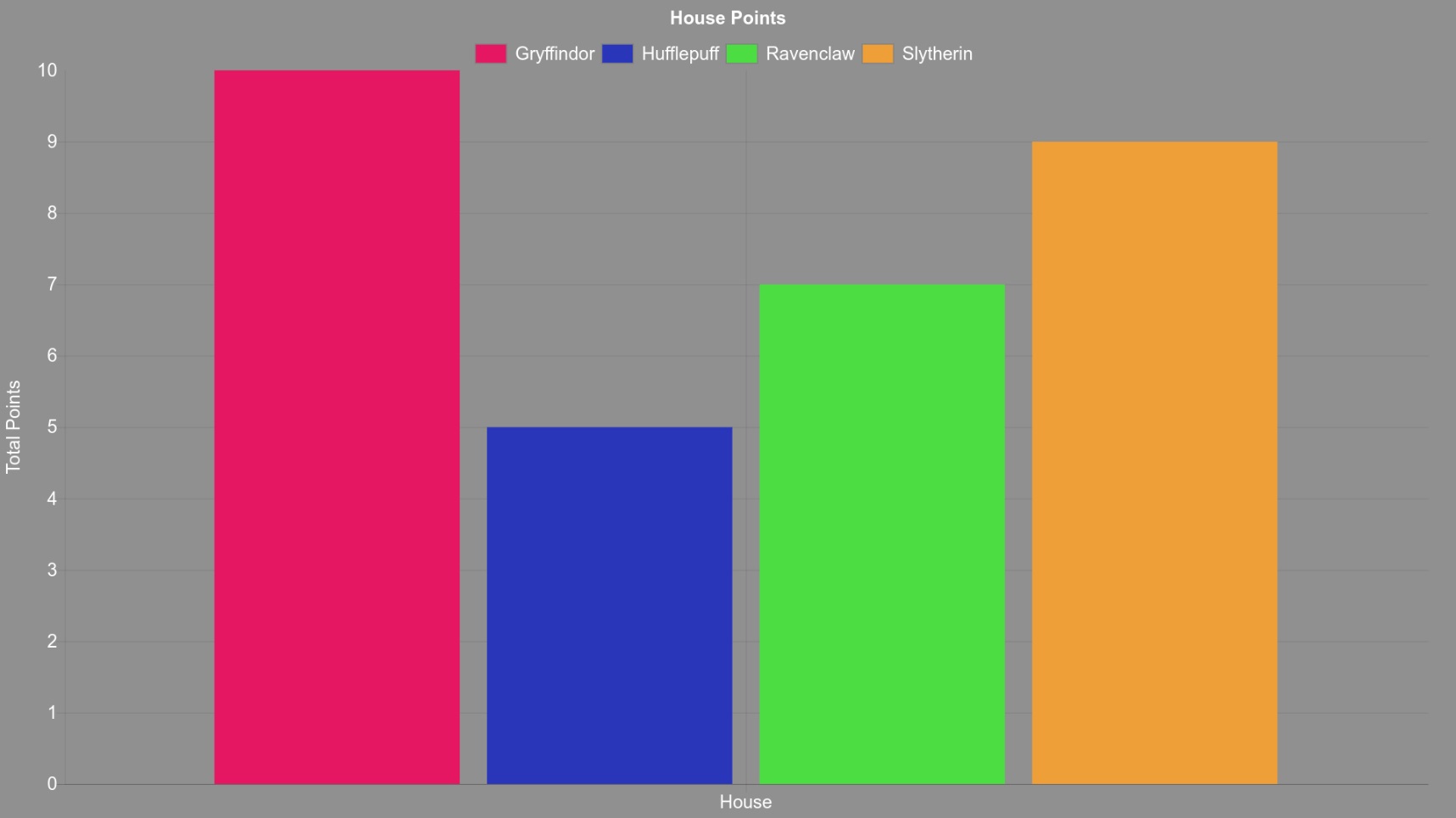
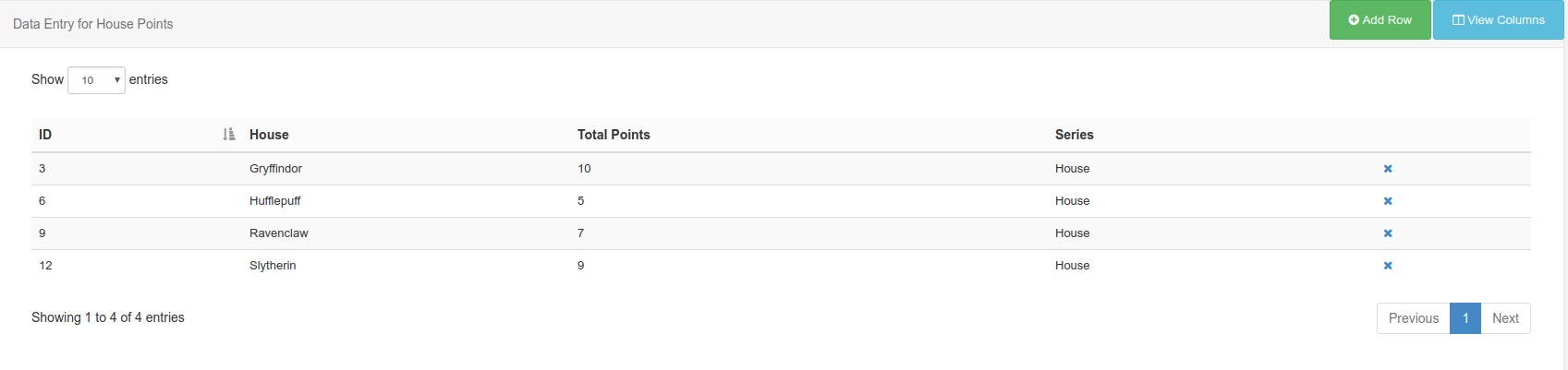
I’m making a layout for the school I work at which is incredibly basic, I noticed the Chart module and thought that it’d be a good way to show the data. We’re just showcasing total house points, so my dataset consists of 4 rows and 2 columns.
The columns are House Points and Total Points, and the rows are the 4 different houses.
If I create a chat, my X Axis is House Name, my Y is Total Points. Is there any way to differentiate colours between the different bars on the X axis? As far as I can tell, the colours only take effect on the Series identifier.
Thank you for sending the screenshots of your settings. The behaviour you are seeing on the chart is correct based on the way your dataset is currently set up. A possible solution would be to create a column for your X axis, a column for your Y axis and a third string value column. All rows in your dataset need to have the same value for this new string field. I’d suggest using the value “House”.
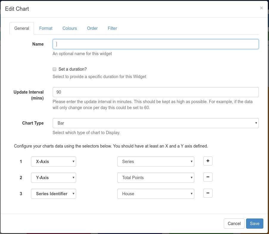
Once you have done this, open the layout designer and edit the chart item you have created. In the general tab, you will now see your 3 created columns at the bottom. Set the X and Y axis as you would before, but set the third column to Series Identifier. This should now correctly show each column to the requested colours. You’ll also need to enable the legend at the top of the chart, stating what each colour bar on your chart represents. Whilst this means the bars of data are not labelled on the X axis, it does give you a colour coding as you wanted and the legend will still identify those bars. I have attached a series of images to show you an example of the configuration and end result.