Hi, I’m using the API to create a layout with an emebedded widget inside.
The HTML code is very simple :
<div id='body' class='layout_type_0'>
<div class="container_layout_0">
<div id='layout_0_main_div'>
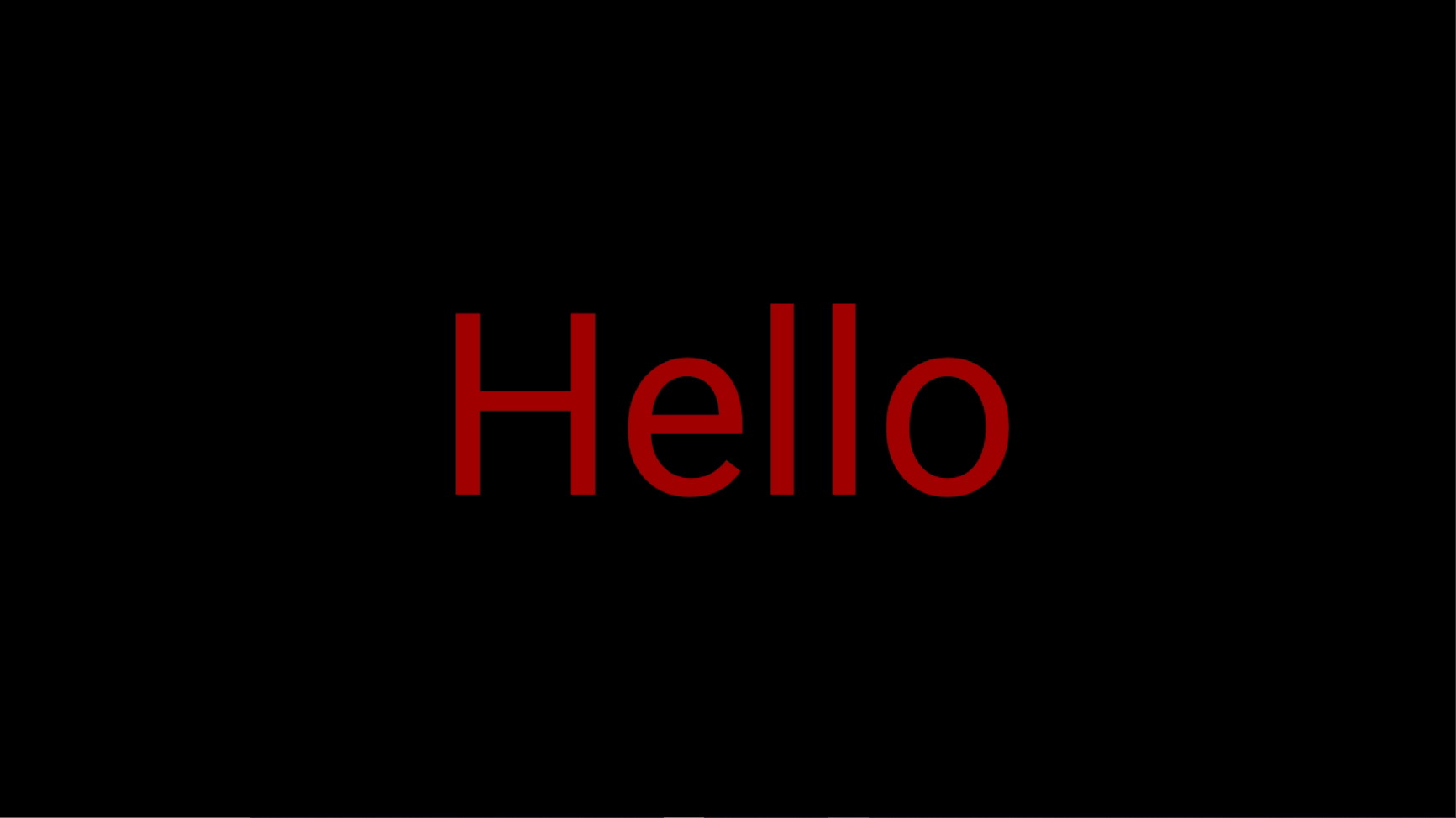
<div style="text-align: center">
<span style="color: rgb(161, 0, 0); font-size: 336px;">Hello</span>
</div>
</div>
</div>
</div>
And here is the CSS code:
* {
  margin: 0;
}

body {
    background-color: rgba(0,0,0,0);
    font-size: 600%;
    animation: 1s ease-out 0s 1 opacityFade;
    position: absolute;
    width: 100%;
    height: 100%;
    overflow-wrap: break-word;
    word-wrap: break-word;
}


.blinkslow{
  animation: blink infinite 3s linear;
}
.blinknormal{
  animation: blink infinite 1.5s linear;
}
.blinkfast{
  animation: blink infinite 0.6s linear;
}


#layout_0_main_div {
  width: 100%;
  position: absolute;
  top: 50%;
  left: 50%;
  transform: translate(-50%, -50%);
}

#layout_3_main_div {
  width: 100%;
  position: absolute;
  bottom: 10px;
}

.container_layout_0 {
  display: table-cell;
  vertical-align: middle;
}

.layout_type_1_child_0 {
  position: absolute;
  top: 25%;
  left: 25%;
  max-width: 50%;
  width: 50%;
  overflow: hidden;
  transform: translate(-50%, -50%);
}

.layout_type_1_child_1 {
  position: absolute;
  max-width: 50%;
  width: 50%;
  top: 25%;
  left: 75%;
  transform: translate(-50%, -50%);
}

.layout_type_1_child_2 {
  position: absolute;
  top: 75%;
  left: 25%;
  max-width: 50%;
  width: 50%;
  transform: translate(-50%, -50%);
}

.layout_type_1_child_3 {
  position: absolute;
  top: 75%;
  left: 75%;
  max-width: 50%;
  width: 50%;
  transform: translate(-50%, -50%);
}

.marquee.ltrs {
  display: inline-block;
  padding-right: 2em;
  padding-left: 100%;
  white-space: nowrap;
  animation: marquee-ltr 15s infinite linear;
}
.marquee.ltrf {
  display: inline-block;
  padding-right: 2em;
  padding-left: 100%;
  white-space: nowrap;
  animation: marquee-ltr 7.5s infinite linear;
}
.marquee.rtls {
  display: inline-block;
  padding-right: 2em;
  padding-left: 100%;
  white-space: nowrap;
  animation: marquee-rtl 15s infinite linear;
  backface-visibility: hidden;
  perspective: 1000;
  transform: translateZ(0deg);
}
.marquee.rtlf {
  display: inline-block;
  padding-right: 2em;
  padding-left: 100%;
  white-space: nowrap;
  animation: marquee-rtl 7.5s infinite linear;
}

@keyframes opacityFade {
  0% {
    opacity: 0%;
  }
75% {
    opacity: 0%;
  }
  100% {
    opacity: 100%;
  }
}
@keyframes blink {
  0%{
    opacity: 1;
  }
  45% {
    opacity: 1;
  }
  55%{
    opacity: 0;
  }
  90% {
    opacity: 0;
  }
  100% {
    opacity: 1;
  }
}

@keyframes marquee-rtl {
  0% {
    transform: translate3d(0,0,0);
  }
  100% {
    transform: translate3d(-100%,0,0);
  }
}

@keyframes marquee-ltr {
0% {
  transform: translate3d(-100%,0,0);
}
100% {
  transform: translate3d(0,0,0);
}
}
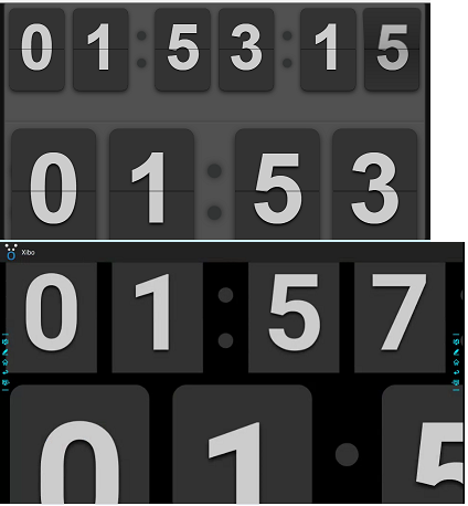
Sometimes, the page is displayed as expected. See the following image:
However, when the layout ends and starts again, there’s a chance that the font-size and position changes as seen on the next image:

To try fixing this, I located the generated HTML file on the player for that layout, copied and pasted the code into in blank html file on my computer, and ran it in a browser just to see if the problem occured. The text was displayed correctly everytime so it didn’t really helped me…
I tried with a Xibo Android v3 and v2.
Do you have any idea on how to fix that bug ?
Thank you.