Helo.
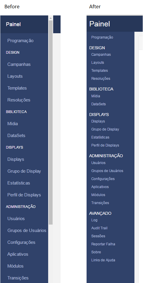
I made some adjustments in the menu css,
Basically I modified the size and spacing of the text.
I liked it because I have more options available without the need to scroll.
Another problem I faced was that in my language some texts did not fit and that bothered me.
My amendments are commented
The modified file was “dashboard.css” that is in the “\theme\default\css”
hope you like 
/*
* Base structure
*/

/* Base */
html {
  overflow-y: scroll;
}
body {
  background: #f3f3f3;
  color: #333333 !important;
}
.row {
  margin-left: 0 !important;
  margin-right: 0 !important;
}
.row > div {
  margin-bottom: 15px;
}
.alerts-container .alert:last-child {
  margin-bottom: 0px;
}
#page-wrapper {
  padding-left: 70px;
  height: 100%
}
#sidebar-wrapper {
  margin-left: -150px;
  left: -30px;
  width: 180px;
  position: fixed;
  height: 100%;
}
.green {
  background: #23ae89 !important;
}
.blue {
  background: #2361ae !important;
}
.orange {
  background: #d3a938 !important;
}
.red {
  background: #ae2323 !important;
}
.form-group .help-block.form-group-inline-message {
  padding-top: 5px;
}
div.input-mask {
  padding-top: 7px;
}

/* Sidebar */
ul.sidebar {
  position: absolute;
  top: 0;
  bottom: 45px;
  padding: 0;
  margin: 0;
  list-style: none;
  text-indent: 20px;
  overflow-x: hidden;
  overflow-y: auto;
}
#page-wrapper:not(.active) ul.sidebar {
  bottom: 0;
}
ul.sidebar li a {
  color: #fff;
  display: block;
/*  float: left;  */  /*Removed by Guilherme Delai*/
  text-decoration: none;
  width: 180px;
}
ul.sidebar .sidebar-main {
  height: 65px;
}
ul.sidebar .sidebar-main a {
  font-size: 28px;
  line-height: 60px;
}
ul.sidebar .sidebar-main .menu-icon {
  float: right;
  font-size: 18px;
  padding-right: 28px;
  line-height: 60px;
}
ul.sidebar .sidebar-title {
  font-size: 15px;	/*Changed by Guilherme Delai*/
  height: 35px;
  line-height: 50px;
  text-transform: uppercase;
}
#page-wrapper:not(.active) ul.sidebar .sidebar-title {
  display: none;
}
#page-wrapper:not(.active) ul.sidebar .sidebar-title.separator {
  display: block;
  height: 2px;
  margin: 13px 0;
}
ul.sidebar .sidebar-list {
  height: 30px;   /*Changed by Guilherme Delai*/
}
ul.sidebar .sidebar-list a {
  text-indent: 18px;  /*Changed by Guilherme Delai*/
  font-size: 13px;   /*Changed by Guilherme Delai*/
  color: #b2bfdc;
  line-height: 30px;   /*Changed by Guilherme Delai*/
}
ul.sidebar .sidebar-list a:hover {
  color: #fff;
  border-left: 3px solid #e99d1a;
  text-indent: 18px;  /*Changed by Guilherme Delai*/
}
#page-wrapper:not(.active) ul.sidebar .sidebar-list a:hover span {
  border-left: 3px solid #e99d1a;
  text-indent: 22px;
}
ul.sidebar .sidebar-list .menu-icon {
  float: right;
  padding-right: 29px;
  line-height: 40px;
  width: 70px;
}
ul.sidebar .sidebar-list a:hover .menu-icon {
  text-indent: 25px;
}
.sidebar-footer {
  position: absolute;
  height: 40px;
  bottom: 0;
  width: 100%;
  padding: 0;
  margin: 0;
  text-align: center;
}
#page-wrapper:not(.active) .sidebar-footer {
  display: none;
}
.sidebar-footer div a {
  color: #b2bfdc;
  font-size: 12px;
  line-height: 43px;
}
.sidebar-footer div a:hover {
  color: #ffffff;
  text-decoration: none;
}

/* Main Content */
#content-wrapper {
  padding-left: 0;
  margin-left: 0;
  width: 100%;
  height: auto;
}
@media only screen and (min-width:561px){
  #page-wrapper.active {
    padding-left: 180px;
  }
}
@media only screen and (max-width:560px){
  #page-wrapper.active {
    padding-left: 70px;
  }
}
#page-wrapper.active #sidebar-wrapper {
  left: 150px;
}

/* Header */
.row.header {
  height: 60px;
  background: #273759;
  margin-bottom: 15px;
}
.row.header > div:last-child {
  padding-right: 0;
}
.row.header .meta .page {
  font-size: 17px;
  padding-top: 11px;
  white-space: nowrap;
  overflow: hidden;
  text-overflow: ellipsis;
}
@media only screen and (min-width : 993px) {
  .row.header .meta .page {
    width: 380px;
  }
}
@media only screen and (max-width : 992px) {
  .row header .meta .page {
    width: 180px;
  }
}
.row.header .meta .breadcrumb-links {
  font-size: 10px;
}
.row.header .login a {
  padding: 18px;
  display: block;
}
.row.header .user > .item {
  width: 65px;
  height: 60px;
  float: right;
  display: inline-block;
  text-align: center;
  vertical-align: middle;
}
.row.header .user > .item a {
  color: #919191;
  display: block;
}
.row.header .user > .item i {
  font-size: 20px;
  line-height: 55px;
}
.row.header .user > .item img {
  width: 40px;
  height: 40px;
  margin-top: 10px;
  border-radius: 2px;
}
.row.header .user > .item ul.dropdown-menu {
  border-radius: 2px;
  -webkit-box-shadow: 0 6px 12px rgba(0,0,0,.05);
  box-shadow: 0 6px 12px rgba(0,0,0,.05);
}
.row.header .user > .item ul.dropdown-menu:before {
  position: absolute;
  top: -7px;
  right: 23px;
  display: inline-block;
  border-right: 7px solid transparent;
  border-bottom: 7px solid #ccc;
  border-left: 7px solid transparent;
  border-bottom-color: rgba(0, 0, 0, 0.2);
  content: '';
}
.row.header .user > .item ul.dropdown-menu:after {
  position: absolute;
  top: -6px;
  right: 24px;
  display: inline-block;
  border-right: 6px solid transparent;
  border-bottom: 6px solid #ffffff;
  border-left: 6px solid transparent;
  content: '';
}
.row.header .user > .item ul.dropdown-menu .dropdown-header {
  text-align: center;
}
.row.header .user > .item ul.dropdown-menu li.link {
  text-align: left;
}
.row.header .user > .item ul.dropdown-menu li.link a {
  padding-left: 7px;
  padding-right: 7px;
}
.row.header .user > .item ul.dropdown-menu div {
  padding: 15px;
}

/* Widgets */
.widget {
  background: #ffffff;
  border: 1px solid transparent;
  border-radius: 2px;
  -webkit-box-shadow: 0 1px 1px rgba(0, 0, 0, 0.05);
  box-shadow: 0 1px 1px rgba(0, 0, 0, 0.05);
  border-color: #e9e9e9;
}
.widget .widget-title {
  color: #767676;
  background-color: #f6f6f6;
  padding: 10px 15px;
  border-bottom: 1px solid #e9e9e9;
  line-height: 30px;
}
.widget .widget-title i {
  margin-right: 5px;
}
.widget .widget-title input {
  width: 25%;
}
/* Reset */
.widget .widget-title .bootstrap-select-searchbox input {
  width: 100%;
}

.widget .widget-body {
  padding: 20px;
}
.widget .widget-body table thead * {
  font-size: 14px !important;
}
.widget .widget-body table tbody * {
  font-size: 13px !important;
}
.widget .widget-body.no-padding .error, .widget .widget-body.no-padding .message {
  padding: 20px;
}
.widget .widget-body .error {
  color: #ff0000;
}
.widget .widget-body table thead {
  background: #fafafa;
}
.widget .widget-body.large {
  height: 350px;
  overflow-y: auto;
}
.widget .widget-body.medium {
  height: 250px;
  overflow-y: auto;
}
.widget .widget-body.small {
  height: 150px;
  overflow-y: auto;
}
.widget .widget-body.no-padding {
  padding: 0;
}
.widget .widget-body button {
  margin-left: 5px;
}
.widget .widget-body div.alert {
  margin-bottom: 10px;
}
.widget .widget-icon {
  background: #30426a;
  width: 65px;
  height: 65px;
  border-radius: 50%;
  text-align: center;
  vertical-align: middle;
  margin-right: 15px;
}
.widget .widget-icon i {
  line-height: 66px;
  color: #ffffff;
  font-size: 30px;
}
.widget .widget-content .title {
  font-size: 28px;
  display: block;
}

/* Blue */
ul.sidebar .sidebar-main a,
.sidebar-footer,
ul.sidebar .sidebar-list a:hover,
#page-wrapper:not(.active) ul.sidebar .sidebar-title.separator {
  /* Sidebar header and footer color */
  background: #273759;
}
#sidebar-wrapper {
  /* Sidebar background color */
  background: #30426a;
}
ul.sidebar .sidebar-title {
  /* Sidebar title text colour */
  color: #627cb7;
}

.news-widget div.article {
  padding-top: 15px;
}