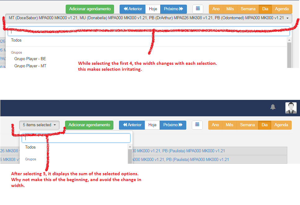
USABILITY IMPROVEMENT: Scheduling screen.
While selecting the first 4, the width changes with each selection.
this makes selection irritating.
After selecting 5, it displays the sum of the selected options.
Why not make this of the beginning, and avoid the change in width.
I would like to point out this same design improvement opportunity on the Layout Designer page when going through the playlist timeline:
dan
3
I’d call this a bug rather than a feature request
dan
Closed
4
This topic was automatically closed after 14 days. New replies are no longer allowed.