Thanks, Dan! I’ve gone ahead and sent my API key to Peter just in case. I appreciate both of your help!
Hi Dan,
Good news for v4 beta and congratulations for this work.
What happened to the timeline?
And how do you add regions individually?
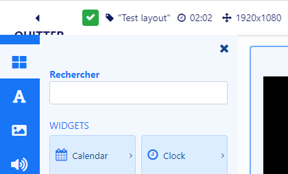
On layout edition, EXIT button (in french) does not appear correctly.
Hi Dan, I’ve been so far away from xibo this month no time to test. But today, is the day, I put all my comments in a PDF.
See you
Fred
XIBOV4 BETA test Report 20230804 by FH_compressed.pdf (800.8 KB)
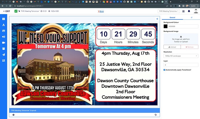
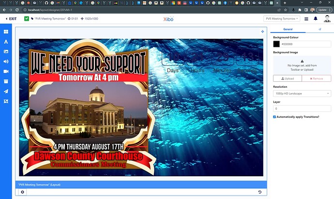
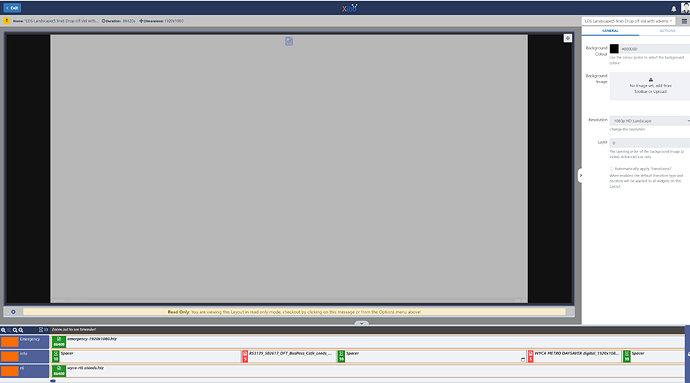
Is there an issue with the new Text and Shapes component not respecting position layers? or is it the preview engine not respecting them? I have a layout with a stack of layers, starting with a 10sec HD vid background loop on layer 0, then a picture and rectangles on layer 1, and then text and countdown clock on layer 2. the pic and countdown clock stay on top of the video background, but the rectangles and text drop down and hide behind the video.
The first image is during design, and the second is during preview playback. I have not pushed this to a player as of yet as I don’t have any beta players installed yet. but I cant get it working in preview then why push it further.
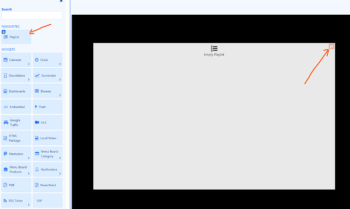
You can add something similar to regions by adding a playlist, and that is also where you’ll find the timeline.
Thanks, I’ve reported this.
Thanks for your feedback, we will dig into the PDF! ![]()
Very interesting with regards to timelines/regions. We really do intend to simplify them and encourage users to think of a layout more like a slide than a series of “regions”. You can still add a region/timeline by way of adding a playlist.
In your examples I think most of your timelines would just be things placed on the canvas with a couple of playlists for when you have multiple items changing in the same place?
We’d love to see more examples and I’m happy for you to DM me any exports you think would be useful for us to see?
The openweather plugin prepaid version doesn’t work.
Did you configure the Open Weather Map connector in Administration → Applications ?
I prefer calendar mode
The calendar mode is good for visualising one or two events/displays, but gets much harder to read when you have more events and more displays. We’re hoping that the combination of the grid mode and the agenda will be much easier to use.
Very curious to hear what you prefer about the calendar mode?
Yeah there is - sorry about that - we will have a fix out tomorrow. Anything you add as an element to the canvas should have its own layer, and that should be obeyed along with the images/videos, etc.
Hi Dan, Let’s focus on the layout Design.
I’ve been using XIBO since V1.4 I saw severals changes in particular using design.
The transition between version 1.x and 2 was difficult, but afterwards I found the concept better for building layouts.
With version 4, I understand that you want to make the designer forget the notion of region, by bringing the design closer to a powerpoint. Why not, but I think it’s a bit of a step backwards.
After all, when I teach people how to use XIBO, I compare XIBO with the odd Excel, don’t I? But remember when you learnt Excel, well first you started to make beautiful tables (titles with frames, cells with well-centred text, etc.) then you learnt to make beautiful calculations.
To come back to XIBO, making a nice table means making a nice page layout, either with the designer’s tool, or indesign, powerpoint, canva draw.io etc then exporting as an image. If you want to make nice calculations, you can use tools like playlists, campaigns, planning and recurrences.
Then we create layouts (beautiful tables) and try to make the best possible calculations for different situations.
What I like about the new design concept is that you can position static elements without a timeline. That’s good. But I’m still not convinced :-), removing the concept of timelines/regions to add playlists that you can’t even find in the playlist menu is confusing.
I’m going to pratice more and more, just to find a way to understand the logic of this new way of making layout.
See you
Fred
We want to have a balance between power users like yourself and content creators - Xibo has been hard to adopt completely for many of our users, particularly when we say “you should make your content in another tool”.
Our aim for v4 is that you can complete your design inside Xibo. Of course, power users may still use another tool, and we need to make sure those are still easy to use with Xibo (like our Canva integration for example).
For RC2 there will be a preview inside the playlist, and we will work on a way to visualise the duration of each widget. I think this will help with the transition, and I’ll try and get a preview of this available for you to see.
I agree with you and I believe there is more we can do here to make it seamless. We’re thinking that Playlists should be a separate item in the toolbar (like images/video/etc), and that when you add a Playlist it should be available in the Playlists page. We’re going to work on this for 4.1.
Thanks Fred, we appreciate the feedback!
Hi Dan,
I agree with you.
Xibo has come a long way in terms of making “beautiful calculations”, and the notion of synchronising content on the displays was long overdue. And for all that it’s a good content scheduler.
If I come back to the notion of a ‘beautiful table’ with the content designer, yes, there are gaps and shortcomings.
Here’s my feedback on the current designer:
0 - having objects such as squares, triangles and exagons is good but still not enough, perhaps the Font Awesome project could be integrated GitHub - FortAwesome/Font-Awesome: The iconic SVG, font, and CSS toolkit)
1 - there should be ready-made, eye-catching templates.
2 - to have visual effects in WYSIWYG (like CSS HERO Code or https://animate.style/)
3 - be able to undo previous actions
4 - be able to build in Timeline mode or Page mode
I know, easy to write ![]()
See you soon
Fred
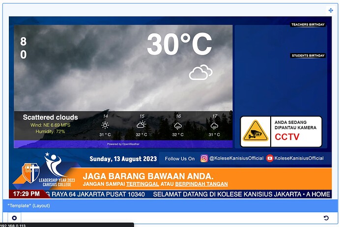
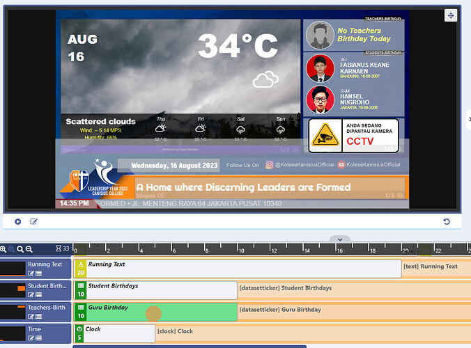
Where is the region, I can’t fine & use the layout as easy as on version 3, we have template/layout like this and work fine, we have layers composition that’s why we need the regions.
We are happy can use Xibo 3.3.7 for school information for years, but sorry, we are not ready for version 4
Return the regions & timeline, please ![]()
Are you able to explain what you find difficult when you try to create your example in v4, and why regions/timeline made that easier in v3?
I really enjoyed using Xibo as an information tool in our school, v.3 is easier, layer settings & region which is quite easy, just by selecting, the part is immediately known
But I will continue to try to use v.4 in the future, for now I’m still in v.3 for some reason
I really appreciate the Xibo team who have worked hard to develop this program
Regards ![]()
![]()
I understand, that makes sense. Thank you for your feedback!
In v4.0 we have added some layer controls to the context menu:
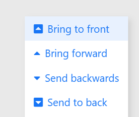
And of course these are available to set on the positioning properties panel (when you select an element):
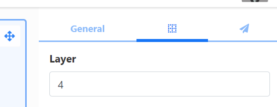
We will be working on a layer tool for v4.1 which should make layering easier to manage.
Hi…
i’m using xibo 3.x version in production and i’m trying new version.
In layout section where is the time bar?
Best
If you want to have a timeline of items you add a Playlist to the layout. You can then get to the playlist timeline by double clicking on the playlist or using the icon to the top right of the playlist:
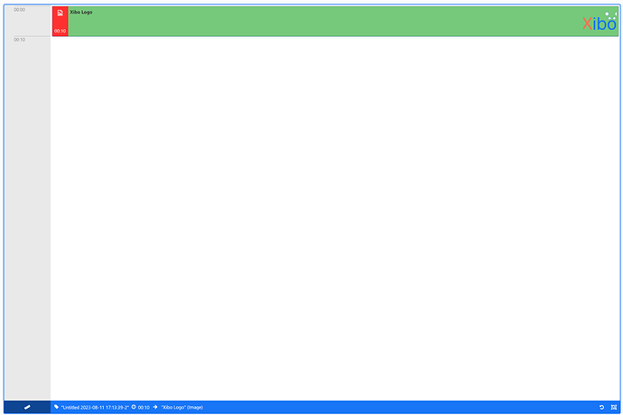
This opens the playlist editor:
You can use the ruler icon at the bottom to adjust between an equally spaced timeline, or a time spaced one with zoom controls.
Hi,
A bit late to the party but have had a quick dabble with the beta version, principally looking at the new layout screen.
We make extensive use of HTML packages to access data feeds to provide constantly updating real time bus information and make extensive use of layers and full screen regions which I could previously easily access and identify using the ‘layer tray’
How can I switch between full screen layers in the new version?
The answer is that you can’t easily to do that in our current redesign. We’ve seen a number of users now asking for better layer controls, so we will be working on adding something for that in 4.1. Most likely in the form of a layer tool which shows you a view of all the elements/widgets on the layout and their layer.
Interesting use case - not something we imagined would be done all inside one layout. Thanks for sharing this, its good to have it in mind as we continue refining v4.
As an aside, have you considered using 3x separate layouts and the overlay scheduling for emergency and RTI? Doing this would negate the need for having a layout with a long duration and provide more flexibility for your info layout.
Although this would only work if emergency and RTI are always on top of info.
I have tried many different variations but this format was settled upon because its really was the only one that I tried which gives a smooth transition between a display of bus times, and public information. advertorial content, with the option of emergency messaging to sit on top of everything.
With separate layouts there is a blanking of the screen whilst the new layout is loaded and drawn, also with an external data feed providing bus info there is a period whilst the HTML package is loaded, makes the connection to the feed, gets the data and redraws itself all creating visual incongruities, so starting it up and keeping a socket to feed open to reload an existing page is visually the best solution I’ve found.
But I’m more than happy to try other methods!
Yeah that makes sense - an overlay schedule would keep that layout on screen achieving the same effect as what you’ve done in one layout, but with the added flexibility of using the scheduling capabilities for your “normal content”. A bit of info on that here if you’re interested - Overlay Layouts | Xibo Digital Signage
All that being said - it seems sensible to bring back a layer tool and we will work on that.
Hi Dan,
I understand this important change (timeline, …) and the desire to simplify things. It’s true that for some users without expirimentation it was complicated.
I think it would be good to make a post about the timeline change.
